Project Background
The automotive industry has been advancing rapidly in terms of in-car user experiences. Digital user interfaces have made significant progress in recent years, allowing for the implementation of features and experiences that were previously unavailable. The digital interface that drivers and passengers use to interact with media, in-car controls, and navigation is now commonly referred to as the "infotainment system," which combines information and entertainment. A well-designed infotainment system should be seamlessly integrated with other interactive elements within the cabin, such as the instrument cluster, HVAC controls, ergonomics, and lighting. For this case study, I will be analyzing the current state of in-car user experiences to identify areas for improvement.

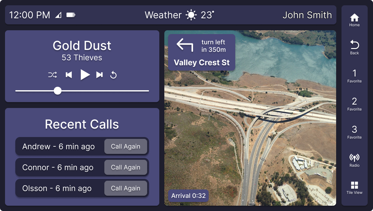
Infotainment Display

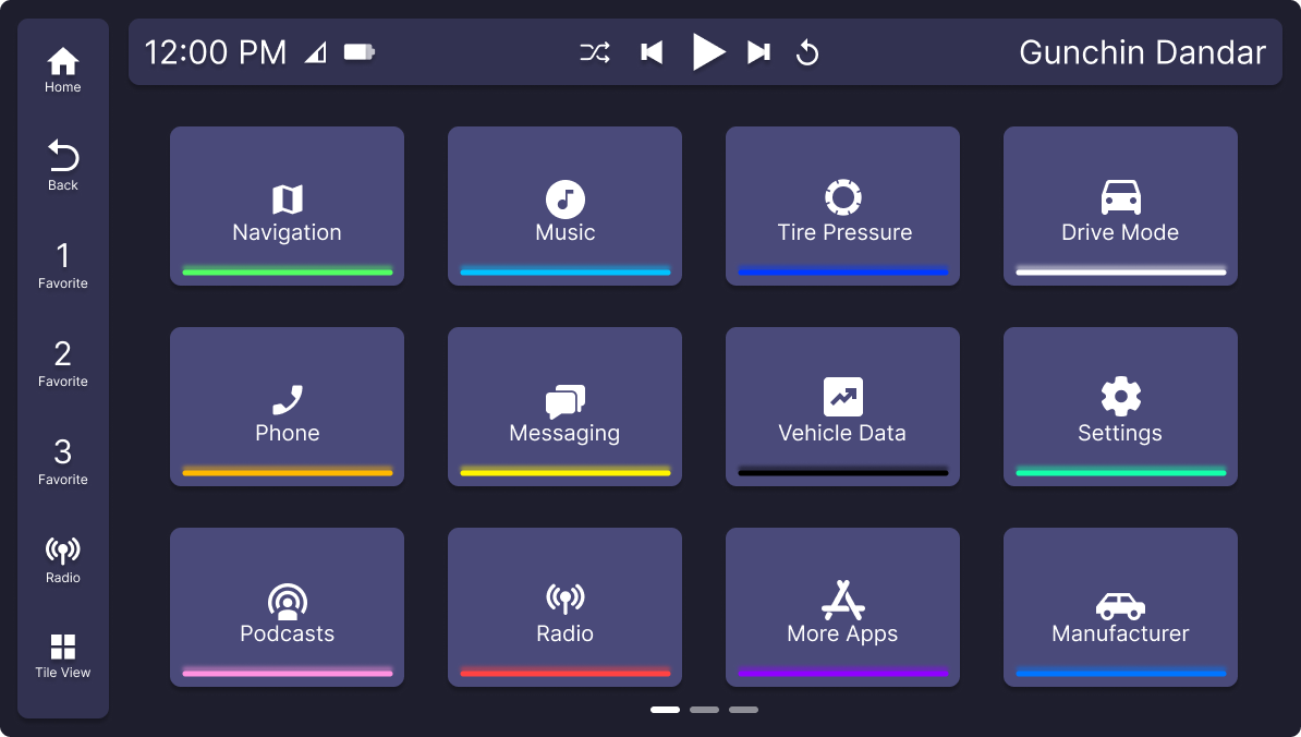
Tile View

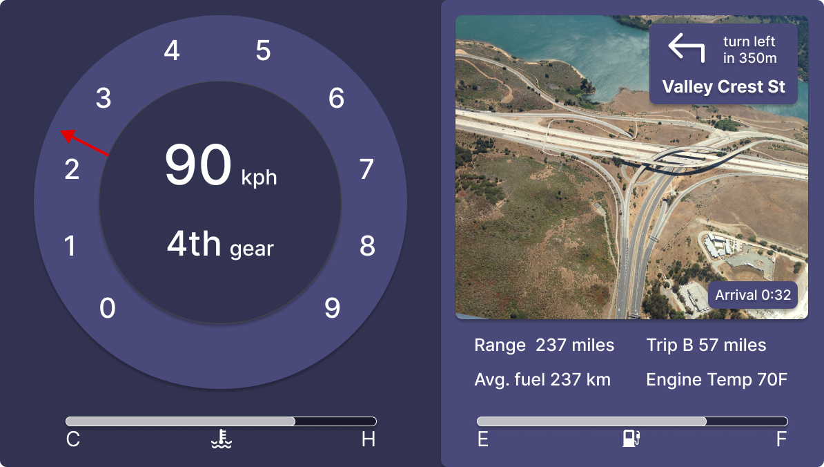
Standard Gauge Cluster

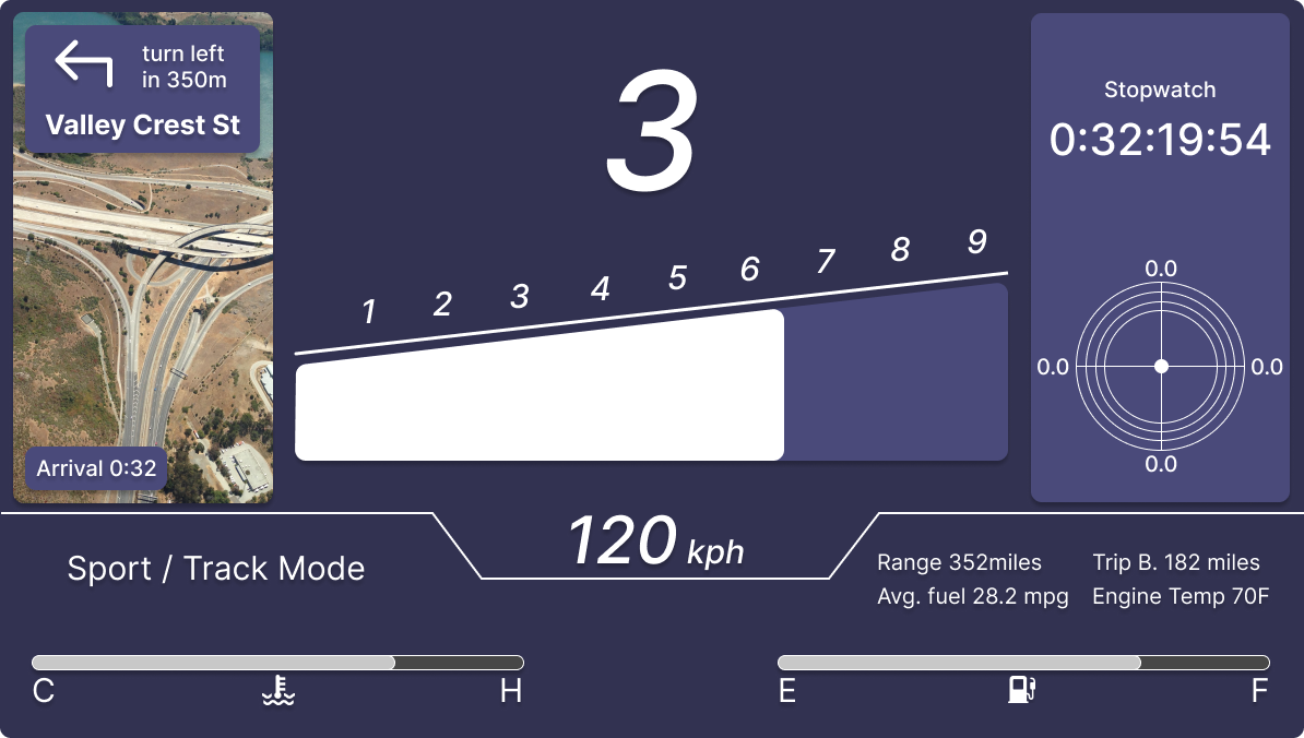
Performance Gauge Cluster
Design Principles
Usability
The system should be easy to understand and use, with intuitive controls and clear visual cues. This is especially important in a driving context, where distractions can be dangerous.
Customization
Users should be able to customize the interface to their preferences, such as setting favourite applications or adjusting the brightness of the display.
Consistency
The interface should be consistent across all features and functions, with a unified design language and visual hierarchy. This helps users navigate the system more easily and reduces cognitive load.
Context
The system should be aware of the user's context and adapt accordingly. For example, the interface should adjust to day or night driving conditions, or automatically switch to a voice interface when the car is in motion.


